Real-World Product Design Exploration
Empowering Users to Take Action: Solving Microsoft Edge Browser Performance Issues
My Role
Product designer
Collaboration with a user researcher, three designers, product manager
Team
20 designers and 1 UX manager
A cross-functional design team
Worked remotely
Scope
Expand side pane performance features in the Edge browser.
Responsibilities
Led UI/UX design for new product requirements
Developed a new information architecture (IA) framework
Crafted prototypes for usability testing
Timeline
3 weeks from start to finish
Results
The feature was successfully launched in the Edge Browser Dev version, known as Browser Essentials. 🎉
Product Overview
The existing model of the Performance Hub on Edge
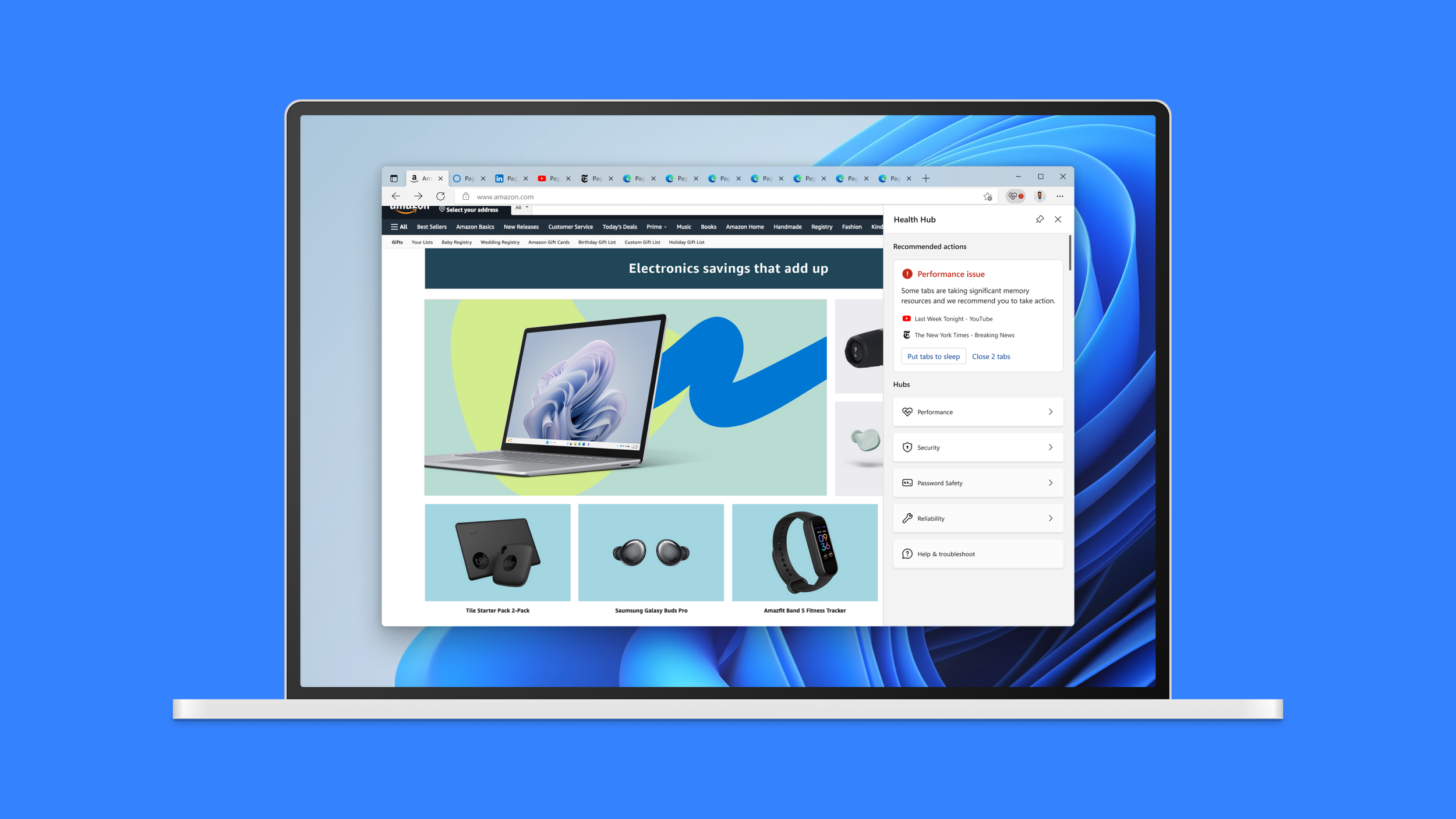
Microsoft Edge has a built-in Efficiency mode and Sleeping tabs which makes the browser start up quicker and boosts performance.
The product team was enhancing the functionality within the side panel. Consolidating these requests into a single framework posed a significant challenge for the team.
Define Users
Based on Microsoft’s research, a significant percentage of adults using a computer consists of less confident users.
My team and I had a brainstorming session and used stickers to vote to determine the most accurate descriptions for our target users.
I ensured that my design direction was aligned with both our persona and Microsoft's user targeting strategy. Our target user group consists of individuals with low computer confidence.
Problem Statement
Extending the multi-component feature on the Performance Hub side pane was challenging due to the limited space.
How might we make Performance Hub content more approachable, actionable, and digestible?
Component Explorations
Exploring design concepts: From tokens to components
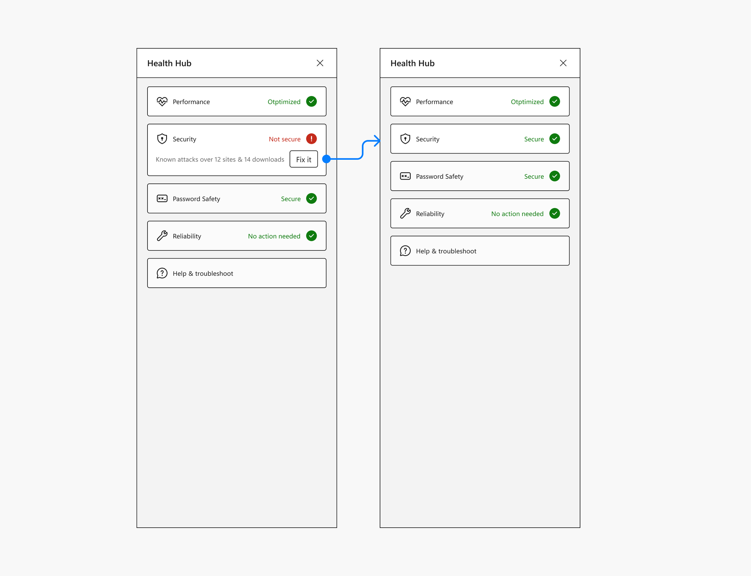
My design process centered around defining how issue statuses, features, and actions are displayed in the components.
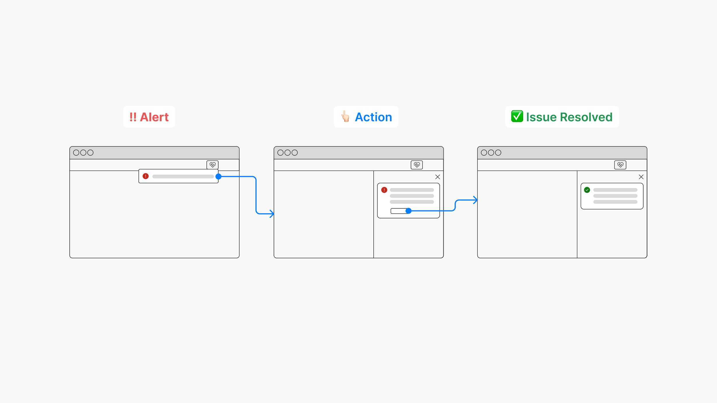
Task Flow
Improved task flow by creating clear visual cues
To facilitate a seamless user journey and accommodate different statuses, I focused on creating clear visual cues.
Wireframing
Explored multiple design concepts by developing rapid wireframes.
Inline component alert
The alert would be embedded within the existing components.
Promotion alert
Alerts are prominently displayed in the top panel.
Drill down navigation
Provides users with direct access to more detailed information.
Dashboard style
Explore various layouts of information architecture and provide more detailed performance insights.
User Testing
A or B?
The UX leader wanted to explore something that resembled a minimal notification-like, straightforward action design. Thus, I refined the wireframes based on the design feedback, developed two prototypes, and collaborated with a user researcher to conduct user testing.
Option 1: Prompt Access to Detailed Information
Users encounter an alert prompting them to click and access the details of the problem before taking action.
Option 2: Recommended actions
Users can take immediate action to address the problem without any additional steps.
Result
Before & after
April 6, 2023 The feature was successfully launched in the Edge Browser Dev version, known as Browser Essentials. 🎉
Conclusion
The solutions I provided for the browser performance facilitated the design research and defined the UX / UI framework based on research output.
The critical process I learned was to design an adaptive framework early in the design process to adapt to every team’s decision at the ambiguous stage.
Are you eager to learn more about the project?
Don't hesitate to reach out to me for additional details. I'd be happy to share my insights with you!


